Sizzle & Stew was released on 15th August 2018, created by myself Chris O'Shea (Cowly Owl), working with Wip Vernooij who did character design, all illustration and animation and Nick Holliday created the 3D models. Sound and music from various libraries.
Concept
Back in 2017, I knew that the future direction I wanted to go with Cowly Owl was making games that families could play together. I thought to myself, what would my take on a cooking game be? What would it feel like? How could people play together?
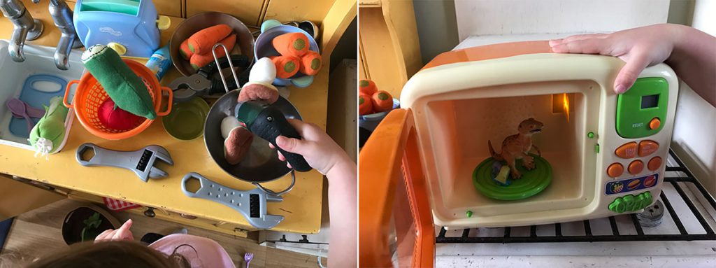
Playing cooking with my own kids with the toy kitchen, I had two things clearly in my mind that I wanted in the game, freedom and mess. Want to put a toy dinosaur in the microwave? Mix food using a power drill? Sure!
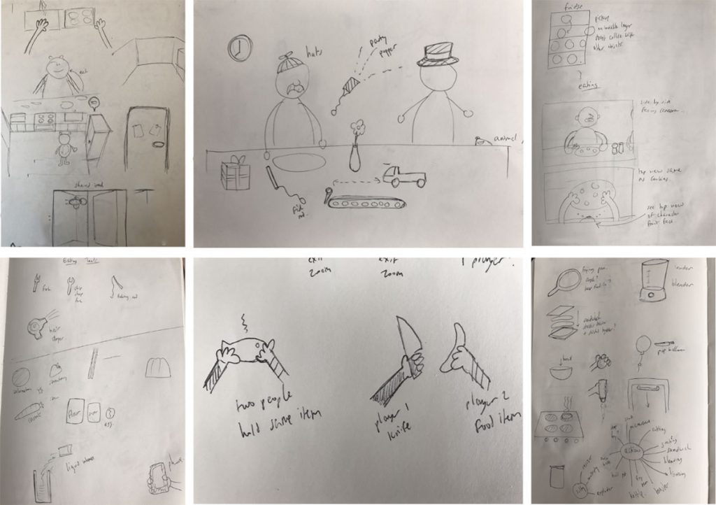
Early on the core idea was that two players could control two characters occupying the same space in the game. I wanted them to be able to interact with each other, to share items or take things from each other. Also the characters in the game should use their own hands when cooking and eating, rather than floating objects being dragged around by the players fingers on the touch screen.
Sketches above show some initial concepts, the player could walk around the kitchen, see their hands in first person mode for cooking and then see the whole character when sat at a table for eating.
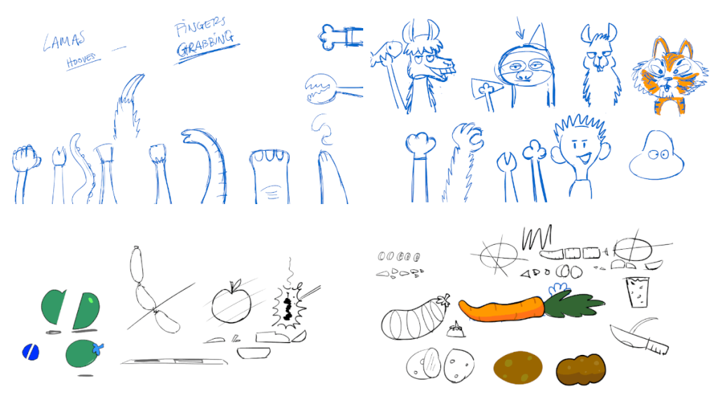
I asked Wip to design animal characters instead of humans. After seeing some sketches it was a very quick decision to use a llama and sloth, as they are lovely animals full of charm and just interesting to look at. Fortunately both of those characters could also have long arms too.
Designing for two players
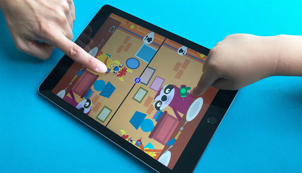
The game has to be playable alone, but I wanted it to be more fun to play together with a friend or family member. The image above shows that in two player mode, you sit facing each other with the tablet on a table and you both have your own half of the screen.
This created all sorts of usability issues that were hard to overcome. I’m not sure I’d make a split screen touch game again. Initially players tried to pass things across the line in the middle, so I restricted the hand movement to their half of the screen. I also made sure that object throwing felt good, with a good feeling of weight and movement to objects.
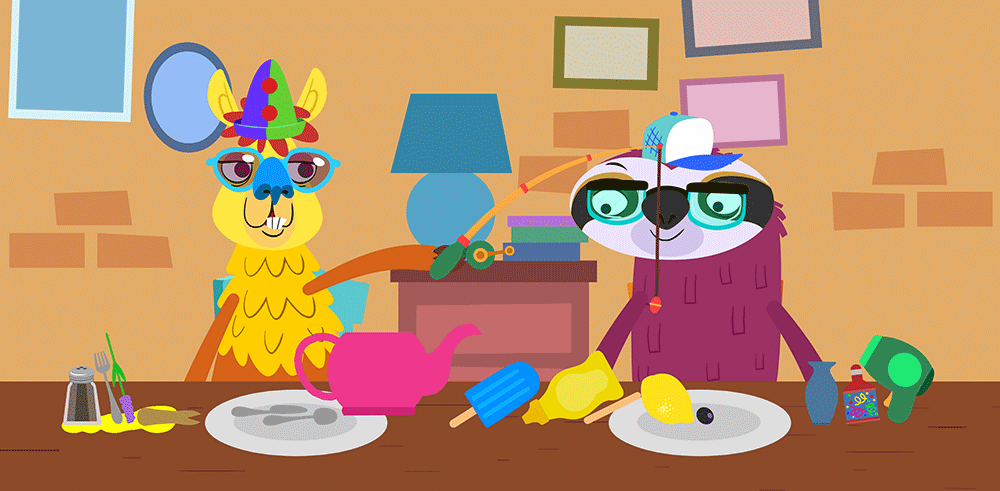
I also created various small ways to encourage players to interact with each other. Here you see the fishing rod, which lets you steal food from the other player's plate, or can be used in the kitchen. You can use the party popper to shower your friend in paper streamers, or the hair dryer to blow away anything in its path.
Within the dining room each player gets a present that reveals a new item of clothing to wear. You can choose to put this on your own head or give it to the other player.
In an earlier version each player could use two fingers (so both arms) in the kitchen and dining room, but this made things very confusing and sometimes triggered system level gestures that would interrupt the game. In the released game, you can still use two fingers and both arms in the dining room, but in the kitchen the limit is 1 arm per player for ease of use.
Messy by design
I love games that use physics as their core mechanic, as it enables creativity through play and unexpected outcomes, sometimes with hilarious results. I aimed for this game to encourage people to make a mess, using physics to cause chaos.
Getting the physics to work all together was quite a headache, because you have many multiples of collision layers and I created a system of internal and external spaces. A cupboard/fridge is an internal space, so the objects inside will collide with themselves but not with objects outside of this space. However when you open the doors, you have to know which objects were dropped into these cupboard spaces to then change the collision layer to make them collide with the internal objects. Add to this moveable spaces like containers/cups/pans etc, it got complicated quickly.
It does mean that by using physics you can stack objects on top of each other, that you can add food to a washing machine and watch it bounce around, launch food from the toaster and have it hit the lights or have slippery frozen food.
I also wanted you to be able to make a mess with sauces, like ketchup or soy. So not only can you add these to foods, you can also colour the kitchen worktop or the dining table.
Connected Interactive Systems
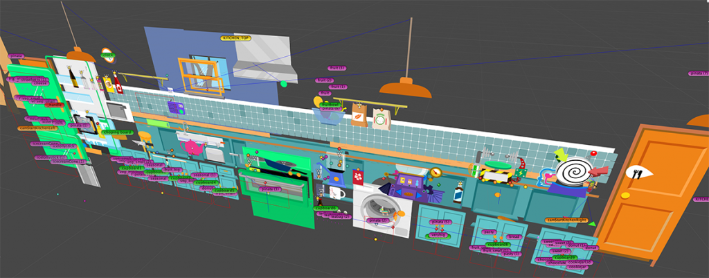
My aim was to give players freedom by creating lots of systems that would work together. So for example there is a liquid system that also works with the heating system, which also works with the heatable food system. If the player wants to fill a cup with ketchup and heat it, they can. Likewise they can make a fish smoothie, cook it and cool it down in the fridge.
There are containers, such as the sink, cups and pan, that can receive liquid and fill up. You can drink from any moveable container using a straw if you take it to the dining room. There are liquid sources, such as the tap, sauce bottles, milk/water bottles, and juicer, that enable you to fill the containers. Once there is liquid in a container, you can heat it using any heat source in the game and it will also heat any food inside. Banana soup anyone?
Finally food can be heated, everything has a temperature and can be burnt. Food can have sauces or sprinkles added to it. When you cut any food into pieces, the system needs to generate new sliced parts and pass the properties (temperature/burn/sauce/sprinkles) to the new parts. That way when you heat a tomato and cut it in two, both halves are still hot.
This along with the physics working together, was one of the things that took the longest to develop.
Graphics
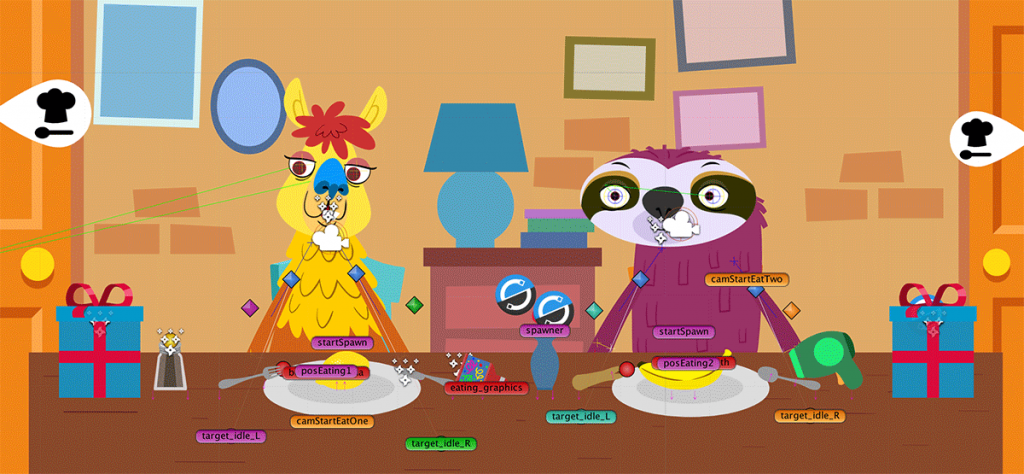
We used mostly vector graphics for small download size and easy scaling (converted to meshes using an SVG Importer plugin that is not available now). Textures (sprites) were used on edible items, to allow them to be cut into pieces. A custom shader on the food allowed layering up of sauces and sprinkles on to the food, keeping draw call counts down. This was especially important using two cameras in two player mode, doubling the draw calls. We used 3D models on the doors, to make them feel great when opening and closing, giving them a sense of depth rather than paper doors.
Playful surprises
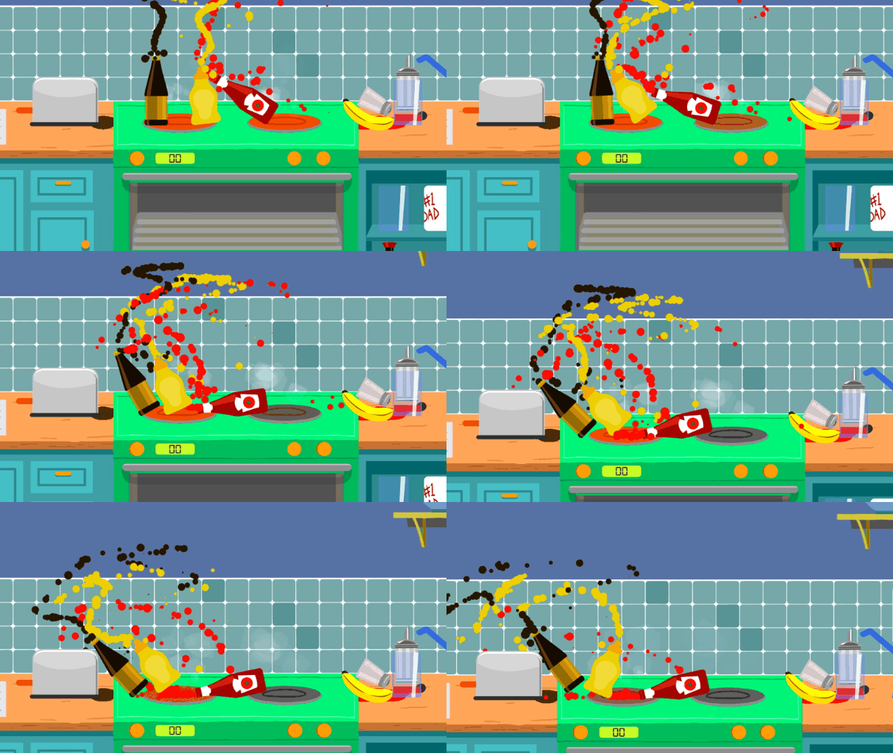
I added quite a few hidden surprises in the game that I hope players will find on their own. You can find a blog post about those here.
Tools
Here are some Unity assets that I used on this project...
Sprite Slicer, for cutting up the food sprites
Water 2D Tool for the liquid volumes
Paint in 3D for the sauce splats on worktops
Dreamteck Splines to create the bendy player arms